VR Tooltip for Hotspot Plugin
vrtooltip_hotspots.xml
for HTML5 and WebVR! (Oculus Rift, Google Cardboard, GearVR, ...)
by Cyril Chauveau - chauveau.cyril@gmail.com
Description
- This plugin WORKS IN VR MODE !
- A simple and customizable tooltip plugin that can be used on a hotspot.
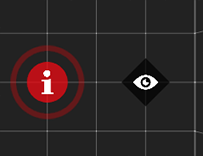
- It is possible to define two differents hotspots (round or square).
- Possible to set hotspots color, size, pulsate, alpha and icon.
- Possible to set all the tooltips or independently (background color, alpha, position, size ...).
- Each hotspots can be individually configured (focus, zoom, fov ...).
Download
Buy and download VR Tooltip for Hotspot Plugin - 23€
(HTML5 only - Krpano version 1.19 pr4 min - html5:"only+webgl"}
(HTML5 only - Krpano version 1.19 pr4 min - html5:"only+webgl"}
Usage
Include the plugin's xml file:
<include url="plugins/vrtooltip_hotspots.xml" />
Setting
These are the global tooltip settings.
<vrtooltip_style
      	tooltips_bgcolor="0x000000"
        tooltips_bgborder="1 0x000000 0.8"
        tooltips_bgalpha="0.8"
        tooltips_bgroundedge="5"
        tooltips_bgshadow="0 4 10 0x000000 0.3"
        tooltips_padding="10 15 10 15"
        tooltips_css="span{font-family:Helvetica; font-size:12px; color:#ffffff; margin:0px;}h1{margin:0px;padding:0px;}"

	hotspots_bgcolor="0xffffff"
        hotspots_pulsate="true"
/>
You can add optionnal attributes in hotspots to overwrite global tooltip settings (see Hotspot settings below)
Plugin Attributes
- tooltips_bgcolor
- Background color for tooltips.
- If attribute is missing, default value will be on backgournd of skin used
- tooltips_bgborder
- Background border size for tooltips.
- If attribute is missing, default value will be on border of skin used
- tooltips_bgalpha
- Background alpha for tooltips.
- If attribute is missing, default value will be on alpha of skin used
- tooltips_bgroundedge
- Background border radius for tooltips.
- If attribute is missing, default value will be on border of skin used
- tooltips_bgshadow
- Background shadow for tooltips.
- If attribute is missing, default value will be on border of skin used
- tooltips_padding
- Padding for tooltips.
- Default=10 15 10 15
- tooltips_css
- Tooltip content customized CSS.
- hotspots_bgcolor
- Hotspots background color.
- Can be set individually using "bgcolor" attribute
- hotspots_pulsate
- Enable/disable hotspots pulse effect.
- Can be set individually using "pulsate" attribute
- Value= true or false
Hotspots settings
<hotspot
        name="spot1"
        style="hsround"
        anim="onover"

        tooltiptext="[h1]scene [/h1][br/][i]italic text[i/]"
        tooltipposition="top"
        tooltipdistance="65"

        tooltipbgcolor="0x000000"
        tooltipbgborder="1 0x000000"
        tooltipbgalpha="0.8"
        tooltipbgroundedge="5"
        tooltipbgshadow="0 4 10 0x000000 0.3"
        tooltippadding="10 15 10 15"
        tooltipcss="span{font-family:Helvetica; font-size:12px; color:#ffffff; margin:	0px;}h1{margin:0px;padding:0px;}"

	icon="skin/info.png"
	pulsate="true"
	bgcolor="0xffffff"
	activehotspotshape="circle"

        scale="0.1"

        focus="true"
        fov="20"

        handcursor="true"
        linkedscene="..."
        onclick="..."
        ...
/>
Hotspots Attributes
- style
- Set CSS style.
- Value =
hsround (round hotspot)
or hsdiamon (diamon hotspot)
or hssquare (square hotspot)
- anim
- Set the way the tooltip appears.
- Value =
onover
or onclick
or persistent
- tooltiptext
- Contains text to display in tooltip.
- You can use standard tags (example: [p][/p] [small][/small] [strong][/strong] [h1][/h1]...)
- tooltipposition
- Position of the tooltip from the hotspot
- Possible values = lefttop, left, leftbottom, top, bottom, righttop, right, rightbottom
- tooltipdistance
- Distance of the tooltip from the hotspot (in pixels)
- tooltipbgcolor
- Overwrite global value bgcolor tooltip's
- tooltipbgborder
- Overwrite global value bgborder tooltip's
- tooltipbgalpha
- Overwrite global value bgalpha tooltip's
- tooltipbgroundedge
- Overwrite global value bgroundedge tooltip's
- tooltipbgshadow
- Overwrite global value bgshadow tooltip's
- tooltippadding
- Overwrite global value padding tooltip's
- tooltipcss
- Overwrite global value css tooltip's
- icon
- Set to add an icon in a hotspot if you add this parameter
- Value = URL to image
- Best if height and width are equal
- .png recommend (Base64 compatible)
- pulsate
- Activate or not the hotspot pulses.
- This option locally replaces the general variable (hotspots_pulsate)
- Value= true or false
- bgcolor
- This option locally replaces the general variable (hotspots_bgcolor)
- activehotspotshape
- Set the shape of the hotspot when the tooltip is active
- Value =
round (round hotspot)
or diamon (diamon hotspot)
or square (square hotspot)
or circle (circle hotspot)
or hide (hide hotspot)
- scale
- Hotspot size.
- focus
- Set focus on the hotspot (not in VR).
- Value= true or false
- fov
- Set zoom on the hotspot (not in VR).
Syntax examples
<hotspot name="hs01" ath="0" atv="0" style="hsround"
tooltiptext="[center]Default round hotspot,[br/][b]basic tooltip[/b].[/center]" />

<hotspot name="hs02" ath="32" atv="0" style="hssquare" scale="0.4"
tooltiptext="[center]Default square hotspot,[br/][b]basic tooltip[/b].[/center]" />

<hotspot name="hs03" ath="-32" atv="0" style="hsdiamon" scale="0.4"
tooltiptext="[center]Default diamon hotspot,[br/][b]basic tooltip[/b].[/center]" />

<hotspot name="hs04" ath="0" atv="32" style="hsround" scale="0.4"
activehotspotshape="circle"
tooltiptext="[center]Default diamon hotspot,[br/][b]basic tooltip[/b].[br/][b]Circle hotspot when the tooltip is active[/b][/center]" />

<hotspot name="hs05" ath="63.5" atv="0" style="hsround" scale="0.4"
anim="onclick"
tooltiptext="[center][b]Tooltip’s animation on click[/b][/center]" />

<hotspot name="hs06" ath="97.25" atv="0" style="hsround" scale="0.4"
anim="persistent" handcursor="false"
tooltiptext="[center][b]Persistent tooltip[/b][/center]" />

<hotspot name="hs07" ath="126.75" atv="-27" style="hsround" scale="0.4"
tooltipposition="bottom"
tooltiptext="[center][b]Set tooltip's position[/b][/center]" />

<hotspot name="hs08" ath="126.75" atv="-14" style="hsround" scale="0.4"
tooltipposition="rightbottom"
tooltiptext="[center][b]Set tooltip's position[/b][/center]" />

<hotspot name="hs09" ath="126.75" atv="0" style="hsround" scale="0.4"
tooltipposition="left"
tooltiptext="[center][b]Set tooltip's position[/b][/center]" />

<hotspot name="hs10" ath="126.75" atv="14" style="hsround" scale="0.4"
tooltipposition="righttop"
tooltiptext="[center][b]Set tooltip's position[/b][/center]" />

<hotspot name="hs11" ath="126.75" atv="27" style="hsround" scale="0.4"
tooltipposition="lefttop"
tooltiptext="[center][b]Set tooltip's position[/b][/center]" />

<hotspot name="hs12" ath="-63.55" atv="0" style="hsround" scale="0.4"
icon="skin/info.png" bgcolor="0xff0000"
tooltiptext="[center][b]Hotspot with icon and custom color[/b][/center]" />

<hotspot name="hs13" ath="-97.25" atv="0" style="hsround" scale="0.4"
pulsate="false"
tooltiptext="[center][b]Hotspot without pulse[/b][/center]" />

<hotspot name="hs14" ath="-126.75" atv="0" style="hsround" scale="0.4"
onclick="openurl('https://google.fr',_blank);" anim="onclick"
tooltiptext="[center][b]Action on a tooltip when clicking[/b][/center][br/][small]example : link to google.com on onClick event[/small]" />

<hotspot name="hs15" ath="-97.25" atv="-32" style="hssquare" scale="0.4"
tooltipdistance="30" tooltipbgcolor="0xff0000" tooltipbgborder="2 0xffffff 0.8"
tooltipbgalpha="0.5" tooltipbgroundedge="5" tooltipbgshadow="0"
tooltipposition="bottom"
tooltiptext="[center][b]Example of personalized tooltip[/b][/center]" />

<hotspot name="hs16" ath="-97.25" atv="32" style="hsdiamon" scale="0.4"
tooltipdistance="75" tooltipbgborder="0 0xffffff 0.8"
tooltipbgalpha="0" tooltipbgroundedge="5" tooltipbgshadow="0"
icon="skin/eyes.png" bgcolor="0x000000"
tooltiptext="[center][h2]Example of personalized tooltip[/h2][/center]" />